Enhancing the conversion rate through a UX analysis, seamlessly uniting the crucial pillars of user experience (UX) and conversion rate optimization (CRO)
Summary
The goal for the project is to optimize the conversion rate and elevate the user experience with a redesign, featuring enhanced visuals and improved UX for user-friendly customer journey.
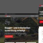
Meerforellenblinker.de is the online destination for sea fishing gear, offering a diverse range of fishing lures and essential accessories to enhance the open sea angling adventures.
Stack
Figma
Shopify
Platform
Webshop
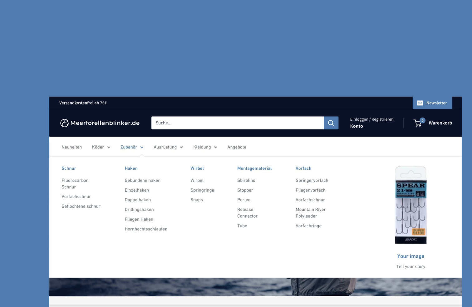
Navigation
The challenge
Excessive collections options and unclear category level divisions complicate product search and lead to user frustration.
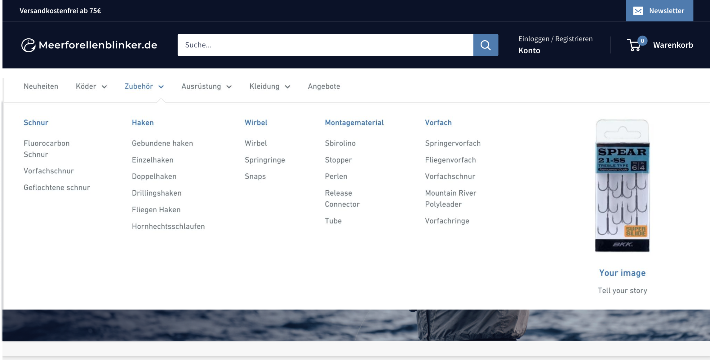
The product category "Weitere" does not provide information about the content, resulting in a surprise about what is hidden inside.
Navigation
The Solution
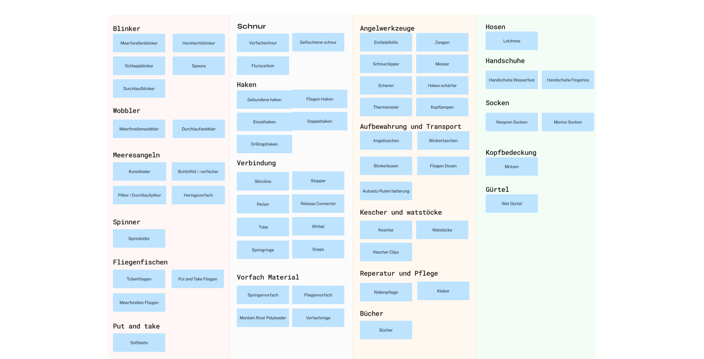
Through a card sorting exercise with my clients, an overview was created for the numerous products. The products were reorganized to significantly enhance user product discovery.
Mega-menu to effectively utilize the entire space of the website. Enhanced contrast in the navigation to optimize filter options by limiting product categories for improved user-friendliness.
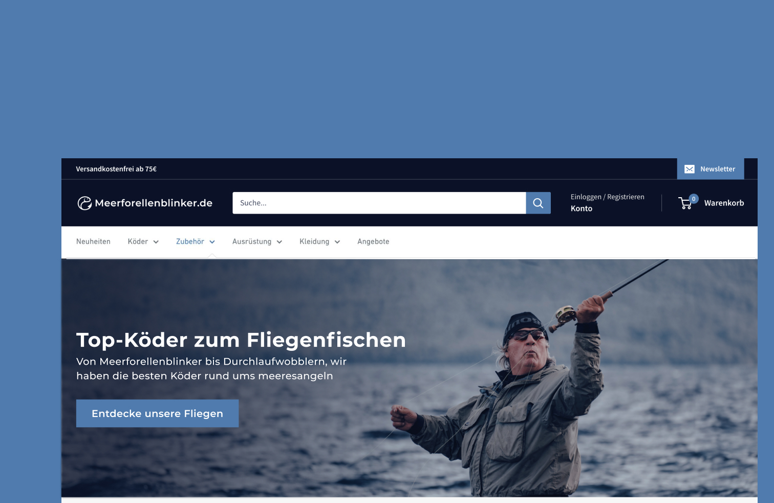
Hero Section
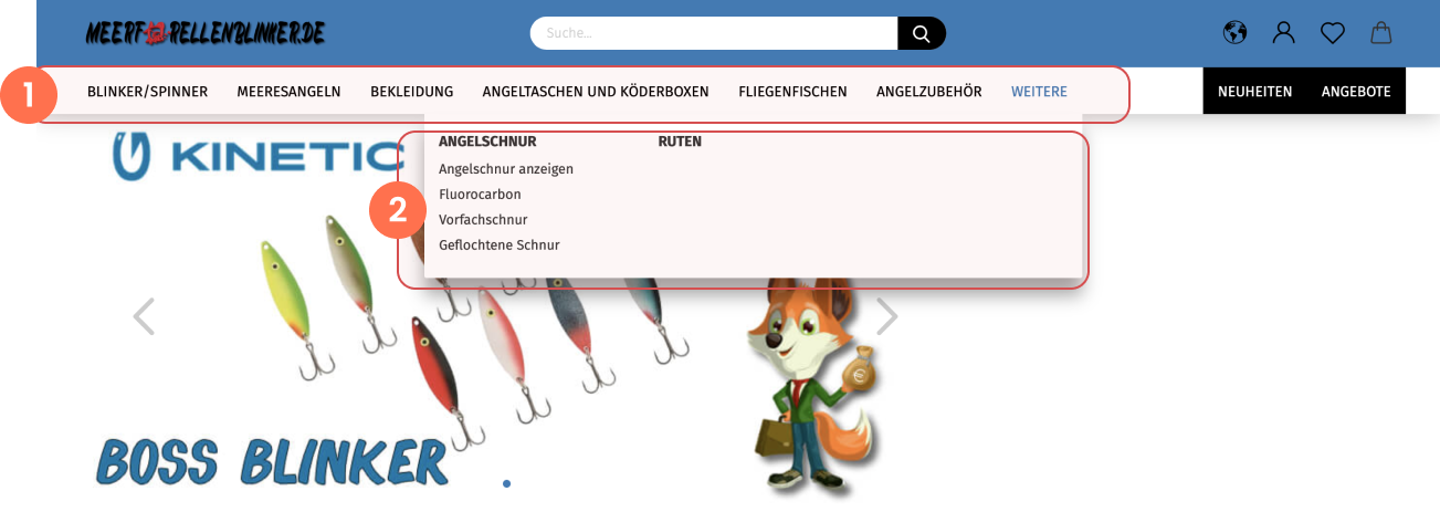
The Challenge
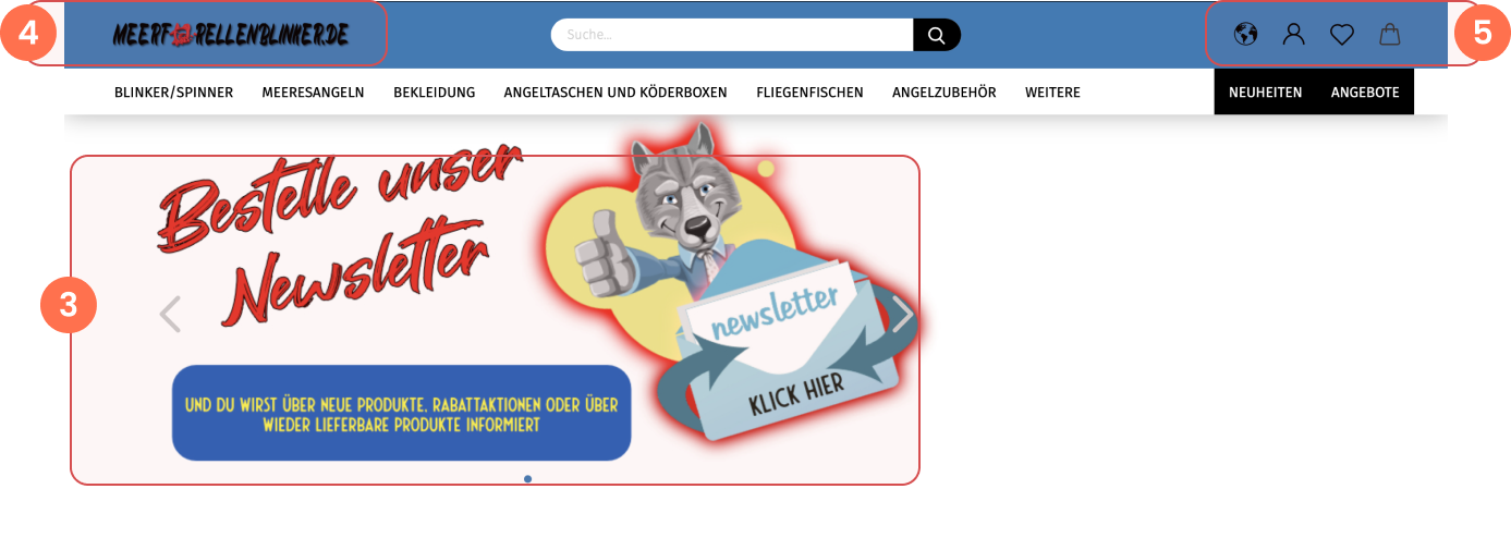
Lack of context confuses visitors and hinders understanding of the website. Newsletter dominance in the header. Missing call-to-action (CTA). Misplaced hero section and puzzling "Sparfuchs" (Thrifty Fox).
Lack of contrast in the logo, unreadable font choice, and the red fish is not recognizable.
Lack of contrast hinders the readability of the navigation.
Hero section
The Solution
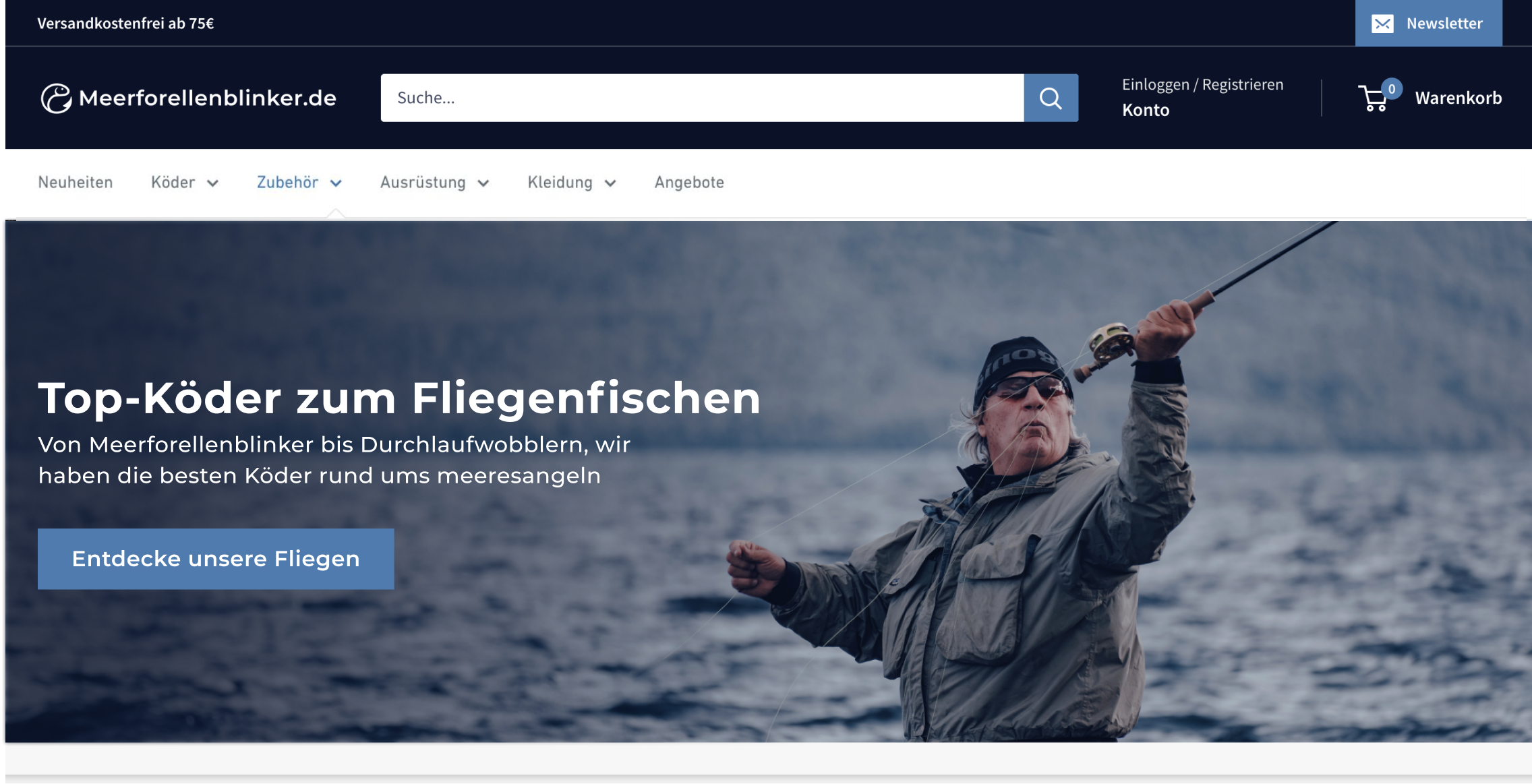
Clear messaging in the hero section through impactful heading, subheading and images, to immediately convey the purpose of the website.
Clear calls to action (CTA) to provide users with clear steps and interaction opportunities.
The light blue color will now only be used as an accent color; a dark blue has been introduced to provide tranquility and sufficient contrast.
Recommended products
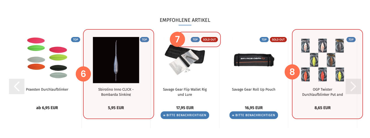
The Challenge
Product images with different background colors appear inconsistent and impact the aesthetic presentation.
Products are recommended that are not in stock.
Unclear and non-transparent product quantity during purchase due to product images showcasing all color variations.
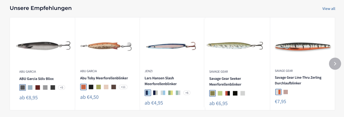
Recommended products
The Solution
Introduce color swatches for a clearer representation of product variations.
Uniform product images, backgrounds, and styles ensure a professional appearance.
Uniform product images, backgrounds, and styles ensure a professional appearance. Optimize image quality: Improve image quality for clear and appealing product presentation.
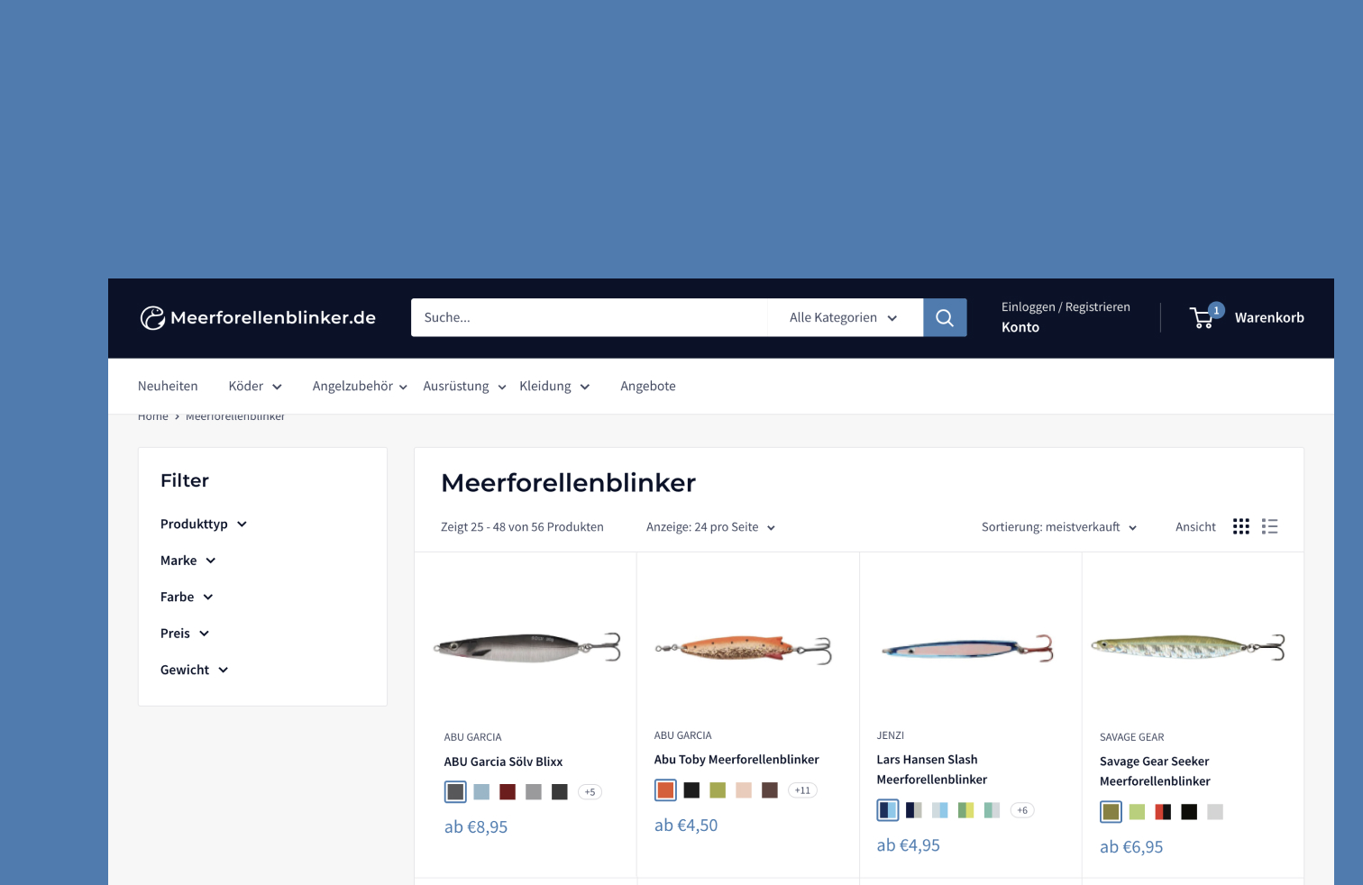
Collection Page
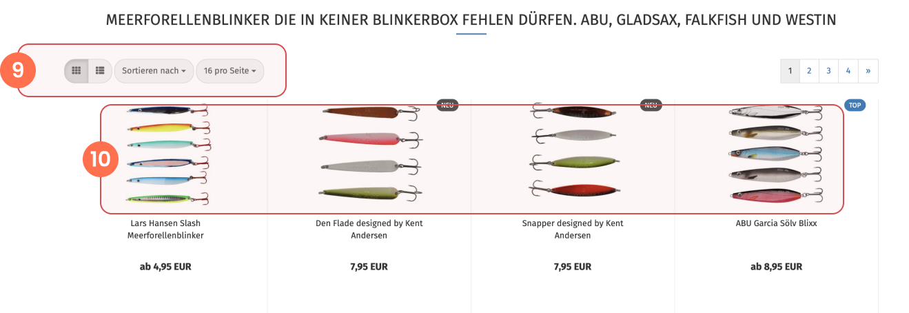
The Challenge
Missing filter options hinder a seamless discovery of products that precisely match the customer's needs.
The abundance of product variations in the images creates visual clutter, causing the customer to experience difficulty in focal points and overall confusion.
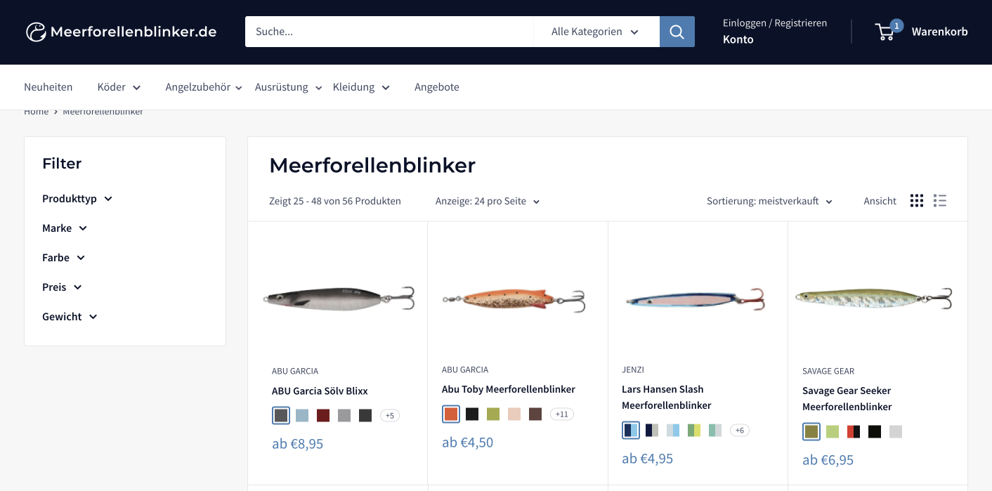
Collection Page
The Solution
Providing options to filter by product type, brand, color, price, and weight assists users in easily finding products that align with their needs, preventing confusion and facilitating a seamless journey to locate their desired items.